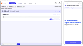
Dividend Reinvestment
Interactive Investor (ii) is a UK-based online investment platform that empowers individuals to take control of their financial futures. Established in 1995, ii has grown to become the UK’s largest flat-fee investment platform, managing assets exceeding £70 billion for over 430,000 customers.
Project
Client
Role
Senior UX designer
Web and mobile app redesign
Interactive Investor
Tool
Figma
FigJam

As the Senior UX Designer within the Servicing Squad at Interactive Investor, I led the redesign of the dividend reinvestment experience across both the website and mobile app. The project aimed to re-platform the existing WebRocker build using the updated design system, improving usability, consistency, and scalability. Collaborating with a cross-functional team (Product Owner, Product Analyst, Developers, UX Researcher, QA, and API Engineers), I worked on modernizing the interface, streamlining workflows, and ensuring a seamless experience across platforms. The redesign focused on enhancing user navigation, reducing friction in the reinvestment process, and aligning the experience with the company’s evolving product standards.
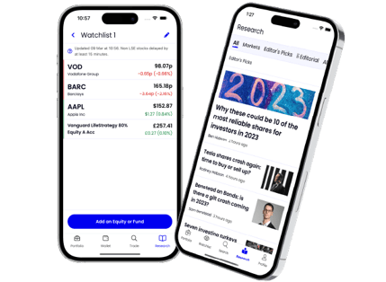
Overview
Project goals
Business Goals: Improve efficiency, modernize the platform, and ensure scalability for future enhancements.
UX Goals: Enhance usability, maintain design consistency across web and app, and create a more intuitive experience for investors.
To ensure the redesigned Dividend Reinvestment feature effectively met user needs, we conducted discovery research to uncover any additional user requirements.


Discovery Research
Recruitment & Method
We recruited five users through Hotjar based on the following criteria:
Active Interactive Investor customers
Dividend earners
A mix of users with and without Bed & ISA experience
Each participant took part in a remote, moderated usability interview via Microsoft Teams, where they interacted with a prototype to provide real-time feedback. To complement these insights, we also engaged with Customer Experience (CX) representatives to identify recurring user challenges and ensure our design solutions addressed real customer needs.
Research aims
Goals
Identify pain points in the current dividend reinvestment journey, particularly for new investors.
Understand user expectations and decision-making processes when enabling or managing dividend reinvestment.
Evaluate the clarity and usability of the existing experience, ensuring it aligned with users’ mental models.
Gather insights from both new and experienced investors to ensure the redesign catered to different levels of familiarity with the platform.
CX Insights


Interview Insights
Participants generally demonstrated a strong understanding of dividend reinvestment and its purpose.
Reasons for Choosing Dividend Reinvestment:
Leveraging compound growth to accumulate wealth over time.
Reasons for Opting Out of Dividend Reinvestment:
Greater control over the price and timing of stock purchases.
Flexibility to allocate funds toward other investment opportunities.
Easier capital gains tracking when manually managing dividends.
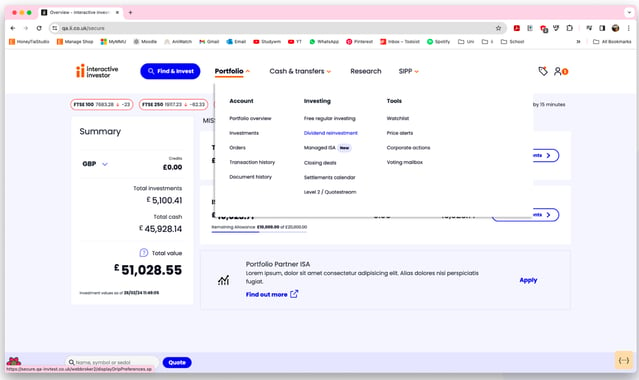
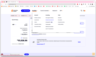
Most users found the page easily, though one initially searched in the Trading section before locating it under the Profile icon.
Users found the existing content clear and important, but some requested:
A glossary or list of investment terms.
More details on processing time and stock prices for reinvestments.
a. Navigation
b. Content & Information

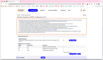
c. Selection & Feedback
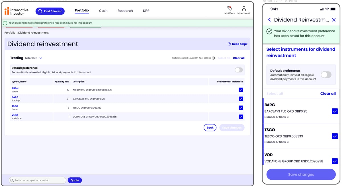
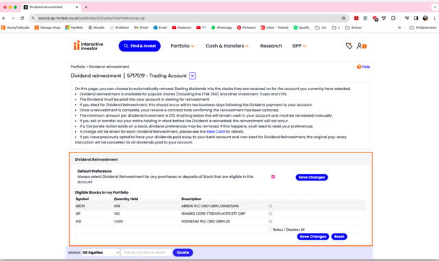
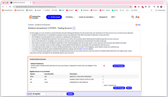
Users generally understood the selection process, though some missed the ‘saved changes’ confirmation message.
d. General Feedback
Displaying dividend reinvestment status on the portfolio screen could encourage more users to enable it.
An explanation of dividend reinvestment would benefit newer investors.
Overall, users found the process intuitive and well-designed, with positive comparisons to other financial platforms.
e. System Usability score
Users found the system easy to use. The Bed & ISA journey received an average SUS score of 84 (Grade B), indicating a high level of usability. For context, a SUS score above 68 is considered above average based on industry benchmarks.
Heuristic evaluation
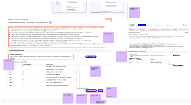
A heuristic evaluation was conducted to assess the usability of the Dividend Reinvestment feature, ensuring alignment with best practices and the updated design system. The evaluation identified key areas for improvement, including navigation clarity, content accessibility, and feedback visibility.


Challenges and Solutions
The existing dividend reinvestment system was built on outdated Webbrocker technology, making it difficult to maintain and leading to inconsistent UI patterns. The workflow was unintuitive and misaligned with the updated design system, impacting usability and efficiency.
Outdated UI & Workflow Inefficiencies
New users struggled to differentiate between key features within the reinvestment process, leading to confusion and errors. The absence of clear guidance and contextual information made it difficult for users to make informed decisions.
Confusing User Experience & Lack of Clarity
The feature was implemented differently across the web and mobile apps, causing friction for users who interacted with both platforms. Disjointed design patterns and navigation structures led to confusion and inconsistencies.
Inconsistent Web & App Experience
I led the UI modernization by implementing the latest design system components, ensuring visual and functional consistency across the platform. By redesigning the workflow, I eliminated unnecessary steps, refined user interactions, and improved overall task efficiency. I collaborated closely with developers and product owners to ensure the new interface was both technically feasible and scalable, allowing for smoother future iterations.
Solution
Solution
I restructured the information hierarchy, introducing clearer labels, inline guidance, tooltips, and contextual prompts to help users understand their options at every step. Through user research and testing, I identified pain points and iterated on designs to simplify complex interactions. Working closely with the UX researcher and product team, I ensured that improvements were backed by user insights, leading to a more intuitive and transparent reinvestment process.
I standardized design elements, interactions, and workflows across web and mobile, ensuring a seamless cross-platform experience. By leveraging a responsive, mobile-first approach, I worked with developers and QA analysts to refine UI elements for consistency. Regular stakeholder reviews and usability testing helped align both platforms, ultimately reducing user frustration and improving adoption rates.
Solution


Managing Scope Limitations & Stakeholder Expectations
Some user requests, such as a dividend investment dashboard to display the monetary value of investments, could not be accommodated due to business constraints and project scope. The project was solely focused on allowing users to turn on/off dividend reinvestment automation, making it necessary to deprioritize additional features.
Solution
In order to combat this, I worked closely with stakeholders, including product owners and developers, to define clear project boundaries while advocating for future enhancements based on user feedback. To address user concerns, I communicated trade-offs transparently, explaining why certain features were out of scope while ensuring users still had a clear, functional experience. I also provided alternative solutions within the existing scope, such as enhanced tooltips and explanatory content to help users understand their reinvestments without a dashboard.


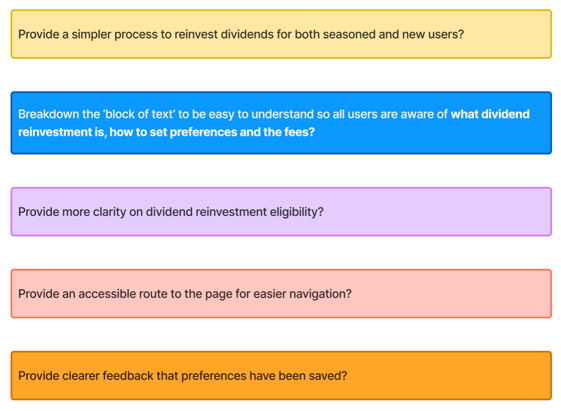
The following "how might we's" were developed as a starting point in the ideation process.
Ideation
User journey
To ensure a seamless experience across both mobile and web, we conducted a comprehensive evaluation of the existing user journeys. This process involved identifying pain points, inconsistencies, and opportunities for improvement while aligning with the updated design system.
Through heuristic evaluation, usability testing, and stakeholder feedback, we:
Mapped out the current user flows to pinpoint friction points and areas for enhancement.
Refined the journey structure to create a more intuitive and consistent experience across web and mobile.
Streamlined navigation and content presentation to better guide users through the dividend reinvestment process.
How might we?

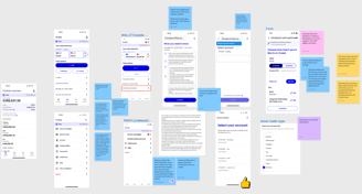

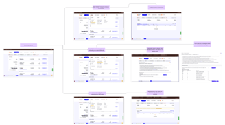
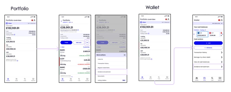
To address discoverability issues, we improved the placement and labeling of the feature, ensuring users could easily locate Dividend Reinvestment settings without confusion.
Added a clear entry point in the portfolio screen to encourage engagement and increase adoption.
On mobile, we tested two different entry points to evaluate efficiency and determine the most intuitive navigation flow for users.


Lo-Fi Wireframes
Clearer content
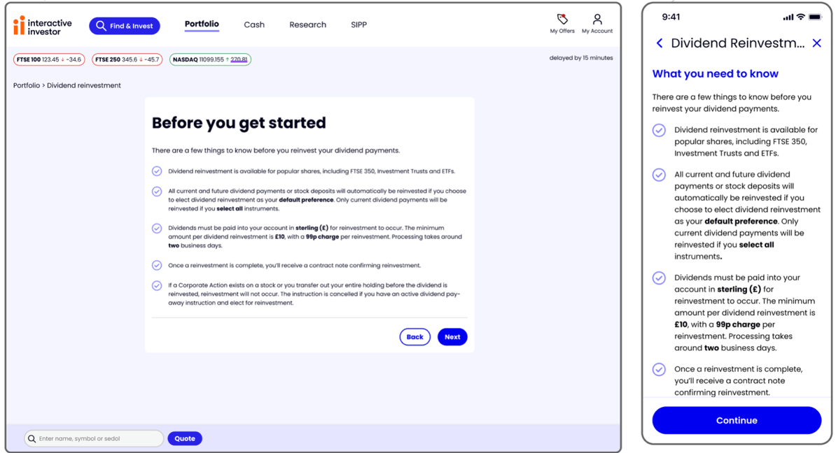
Presented the instructions on a separate page to align with our design patterns to help users, especially newer investors, better understand key financial terms and reinvestment implications.
Provided more transparency on the timeframe and eligibility of reinvested dividends, aligning with user expectations.
Enhanced navigation
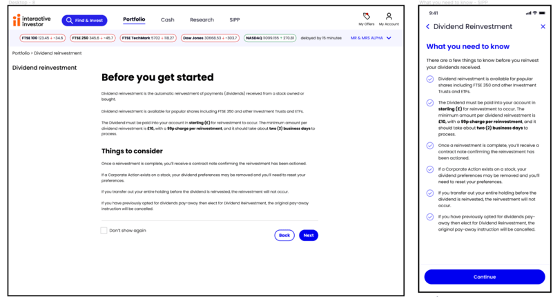
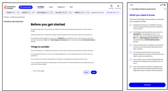
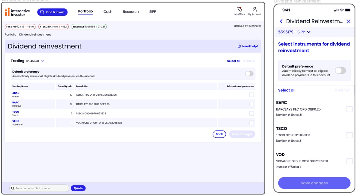
I redesigned the feature page to be more consistent, while also implementing user and stakeholder requirements.
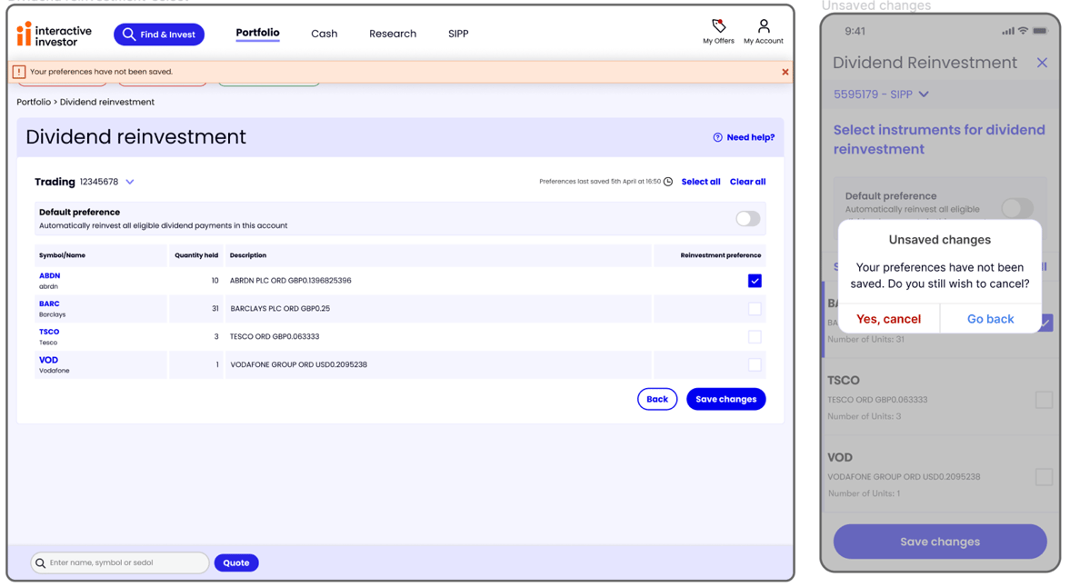
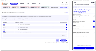
Strengthened confirmation messaging by making the ‘saved changes’ notification more prominent, ensuring users were confident their selections had been applied.
Made the reinvestment process easier to operate, with clearer instructions and call-to-actions
Main feature

Usability testing insights
Once I was done with the first batch of designs and had reviewed with the squad, we were able to proceed with usability testing to make sure the design created was clear and concise with our users. These insights informed me of the next steps in the design iteration process.
From the test, it was indicated that the 'Default preference' feature was not clear
Some users found it tricly to switch accounts
The navigation was not clear
It had a good consumer duty
